Gaia Herzsprung-Russell Diagram
As part of an astronomy course I generated a Herszprung Russell diagram from Gaia satellite data
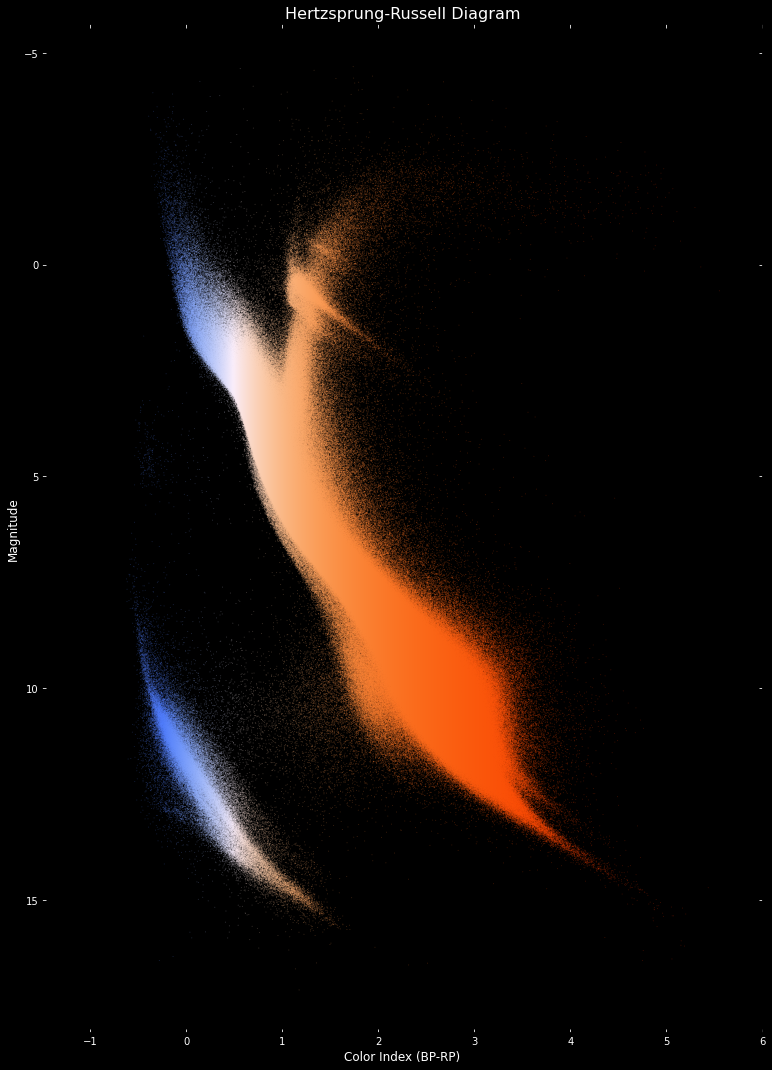
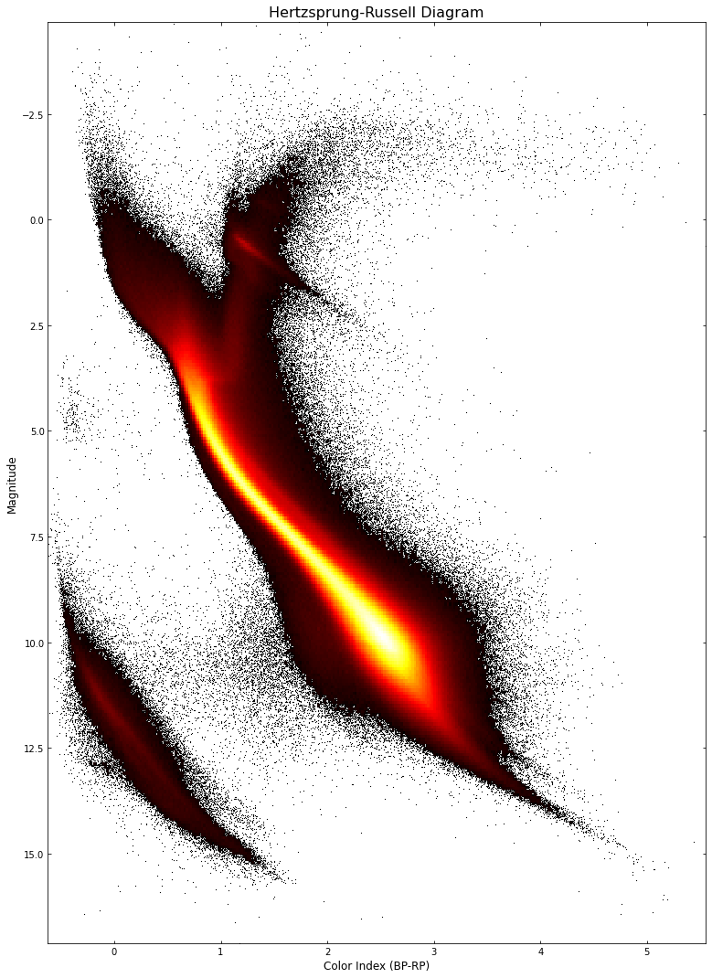
A Herzsprung-Russell diagram shows the nature of a collection of stars by plotting absolute magnitude against effective temperature. The Gaia satellite data is publicly available, and an amazing resource. The databaase contains the measured intensity of the star through various filters and its distance based on parallax measurements. Using the distance and the observed intensity in a given wavelength, it is possible to calculate the absolute intensity of the star. I wanted to convert the star color index to a temperature and calculate an approximate color for the star; something I hadn’t seen on any of the published diagrams. I started off by downloading the Gaia excel files (a small portion of them!) and calculating absolute magnitude. It quickly became apparent that the data needed additional processing and filtering to get a better result.
After some searching, I found a blog post by Vlas Sokolov containing the query I needed to make to the Gaia database, which returns a list of good quality star data (Vlas had found it in a paper here: https://www.aanda.org/articles/aa/full_html/2018/08/aa32843-18/aa32843-18.html). The key to getting good data was to use the error thresholds to extract the more accurate readings; the Gaia database has metrics for the quality of the sensor readings, the accuracy of the distance measurement, etc. The script was a bit old, but didn’t take much to fix, and I had what I needed. (You can see Vlas’ post here: https://vlas.dev/post/gaia-dr2-hrd/). I wanted a large set of stars, so to get around the download limits I ‘chunked’ the data and downloaded a set of csv files which were later combinded into a pandas data table.
Once I had a working diagram with a nice histogram view, I found a lookup table from temperature to black-body color. I used that to create a mapping function and generated the HR plot based on that. The code is available here:
https://github.com/cmaughan/gaia_hr/blob/main/gaia_hr.ipynb
The following plots are for a selection of about 33 Million stars, in the nearest 500 parsecs. Many features of the HR diagram are visible, including the Red Clump. The central strip of stars is known as the Main Sequence and contains stars that are fusing Hydrogen into Helium. The top of the plots contain stars that are Red Giants (on the right branch) or Super Giants (on the left branch). The bottom left contain the white dwarfs. Our sun is currently somewhere in the middle of the main sequence. In a few billion years it will become a Red Giant before eventually transitioning to a White Dwarf.